It seems difficult to build beautifully now. Cost. Codes. For the large-scale developments required to meet growth, few live up to their claims of placemaking, community, and resilience. Character can’t be master planned, after all. But can a new project create a stage where these qualities can grow into reality?
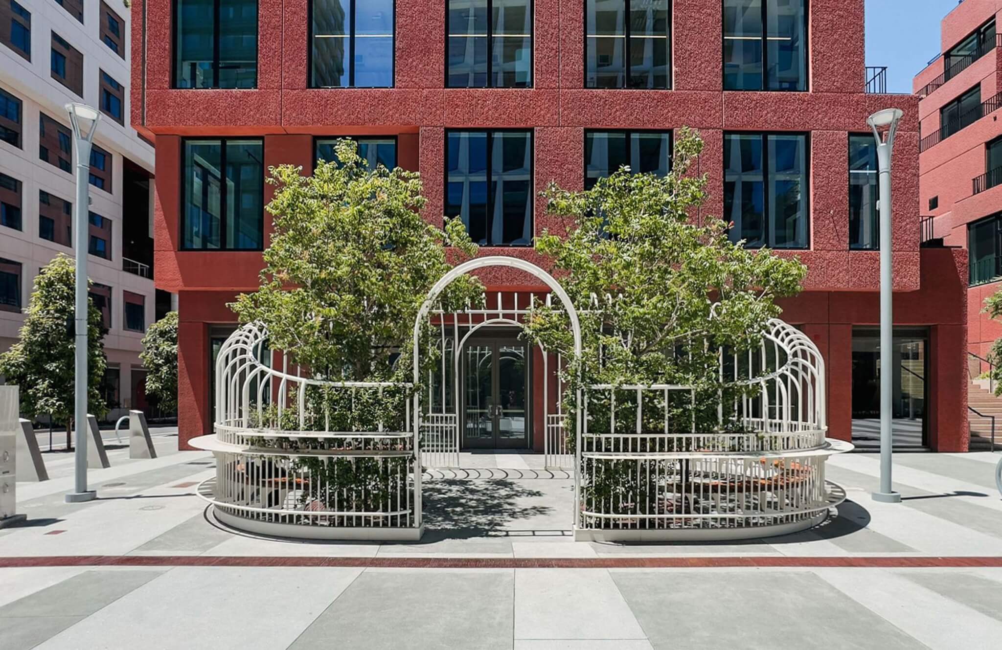
A new project at the Mission Rock development in San Francisco struck me as a glimmer of hope. The Garden Party by Min Design is a petite plein-air structure of curved white metal that takes after Victorian-era conservatories in form and program: The Garden Party is simultaneously architecture, landscape, and social space—an exquisite risk not seen anywhere else in the city.
The Garden Party is one of three “Street Rooms” along Mission Rock’s main thoroughfare.

African Jasmine climbs up the arcing entry, and two trees planted to either side will provide a shaded and fragrant canopy for people to sit beneath for a coffee, lunch, or chat. A wood-slatted bench runs along the interior rim, and a bar counter of white metal encircles the exterior, paralleled beneath by a footrest. Such details are typically missing or treated as afterthoughts, but here you see them vital to the overall setting and its urbanity. “It’s all about relationships.,” noted Min. “We wanted to make something soft and charming to contrast with the angles and modern architecture.”
CMG Landscape Architecture (CMG) initially pitched the Street Room idea for A Better Market Street. That plan got watered down, said principal Willett Moss, “but in the process, we gave a lot of thought to what a street could be and how people could inhabit them.” CMG brought the concept to Mission Rock, where Tishman Speyer and San Francisco Giants held a competition to bring in more voices and diversify the character of the Street Rooms.
The street in question is worth mention. Dr. Maya Angelou Lane runs the length of phase one of the 28-acre project, offering views of the water, the green bleachers of Oracle Park, and the moving silhouettes of bikers, runners, pedestrians on the paths ahead. The street is lined with four new residential and office towers, whose terraced forms and palette take after California’s geologic monuments, with glass-fronted retail at their base.
Unique to the city, the pedestrian-oriented street is curbless, putting all modes of transit on equal (and safer) footing. The corridor has other welcome features, which, like the curbless street and narrower lanes, had them pushing city standards. Instead of the typical 3-foot yellow truncated dome to aid the vision-impaired, they commissioned 1-foot-wide cast iron ones, and tonally ribboned concrete.
The open street design, with its Street Rooms, benches, lending libraries, and wildflower-filled stormwater basins “reinforces the original goal of the streets being where the community comes together,” said CMG’s Corbett Belcher. “The street is the place where public life happens.”

“The design goals of Mission Rock were born out of what was missed at Mission Bay,” said Belcher: The architectural presence, commitment to public space, careful attention to the ground level and materiality. “We have never seen a client so intent on these goals and how they take place,” said Belcher. “As the project matures, how will it change and slowly transform through use?”
Beautiful places accrue over time, shaped as much by design as by people, events, and weather. “Is this a place where that can happen?” Belcher posed. The vines and tree canopy meanwhile are filling out The Garden Party. Soon people will enter its arch or stand around its edge, more alive because such a place is there for them.
So I am curious to find out, and hope that the Garden Party—rather than tootsie-roll street art, along with the curbless streets, stormwater basins, and simple palette of materials seen across Mission Rock can be part of a new era of urban design and life in San Francisco.
Elizabeth Snowden is a writer based in the Bay Area, where she directs the Pallas Gallery.

